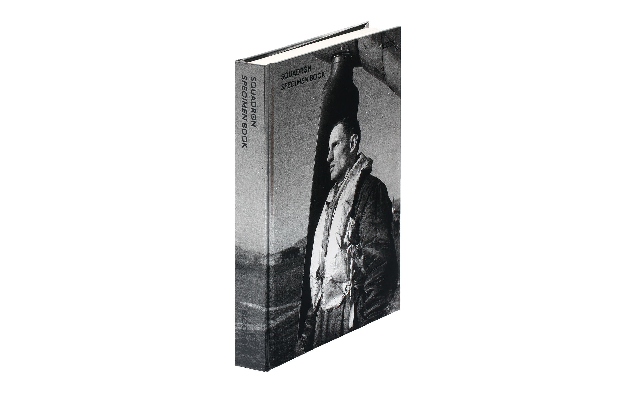
Squadron
(2019)
The Squadron Takes Flight
Squadron is more than just a typeface – it is a result of a research and editorial project dedicated to capturing the story of Czech airmen, in a historical and contemporary narrative. It was born from a desire to soar beyond the visible horizon.
The initial impulse to create the typeface came from a 1942 RAF document. At one point in the film, the word SQUADRON, appeared on the film – blurry, yet still legible. At the same time, my colleague Matěj Hanuer was working on a book about his great-uncle Otto Hanzlíček, an RAF pilot.
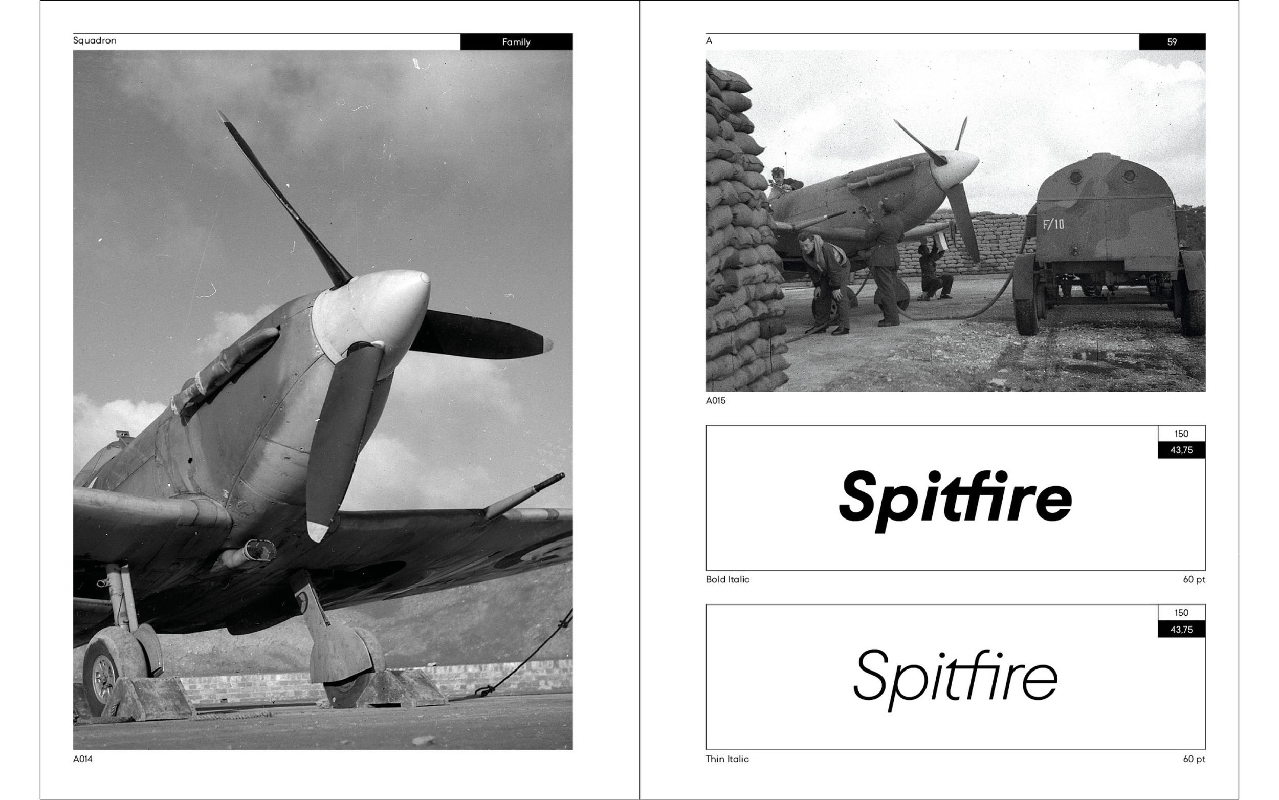
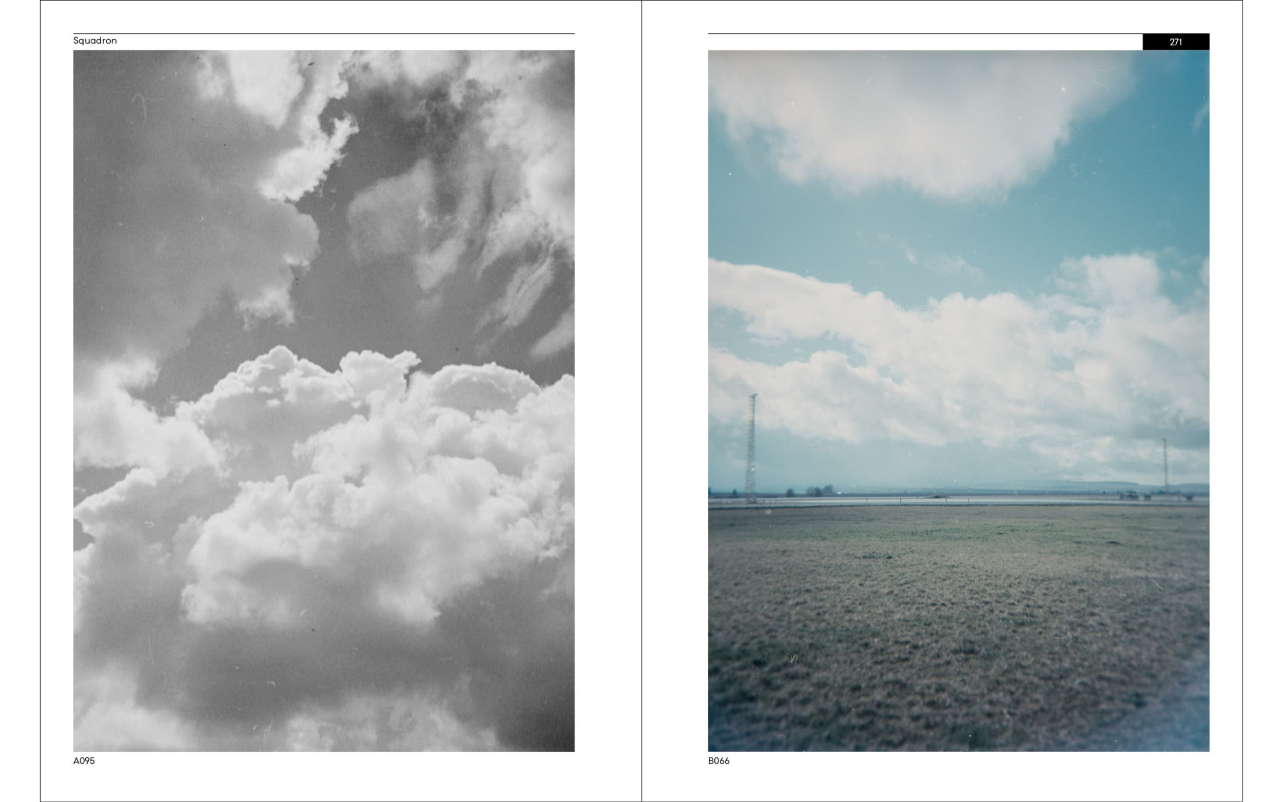
Photographs from Poland, France, Africa and Britain. A pilot's logbook. The rising sun reflecting off the wings of Spitfires. The contrast between man and machine. The unwavering determination in the eyes of the pilots. These images felt like glimpses into another world, yet profoundly close.
Design by freedom
As our research deepened, the project became increasingly personal. Through the form search, we gained an even greater understanding of the content. Our ambition was to embed in the design of the typeface the same values these airmen fought for — freedom and democracy.
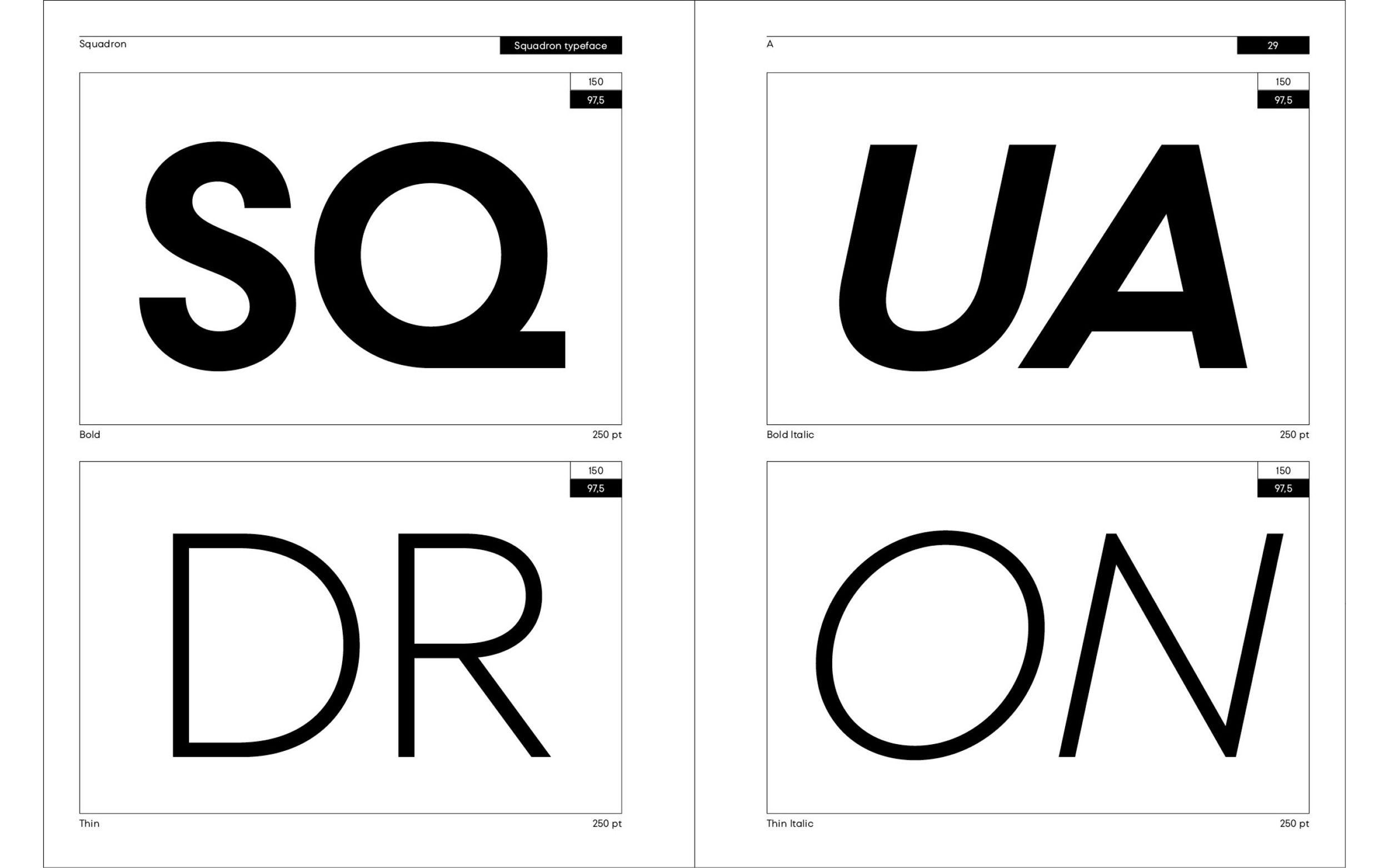
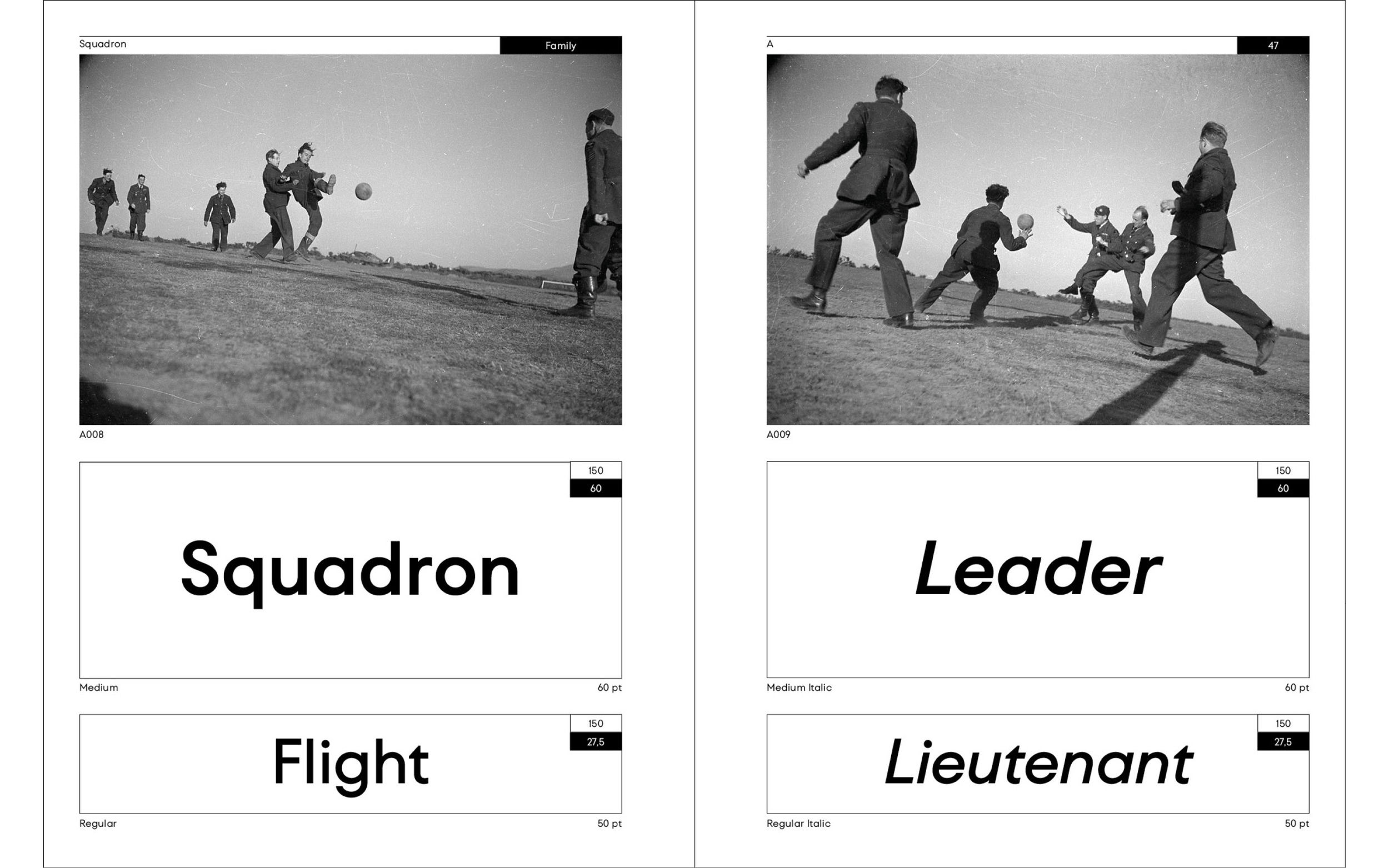
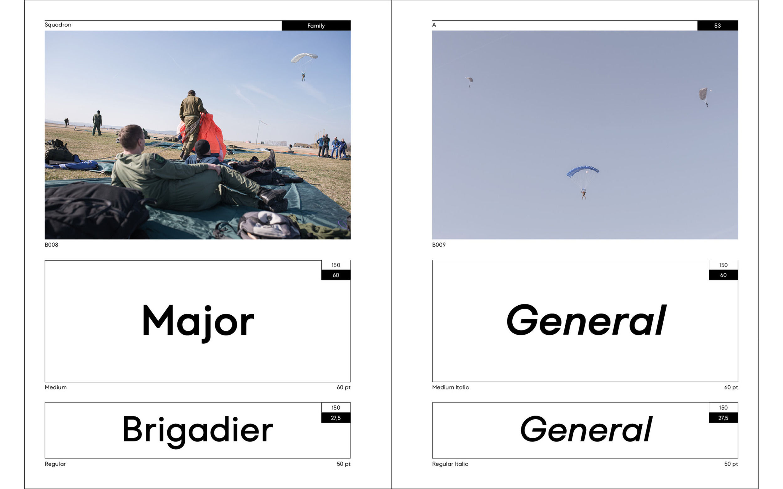
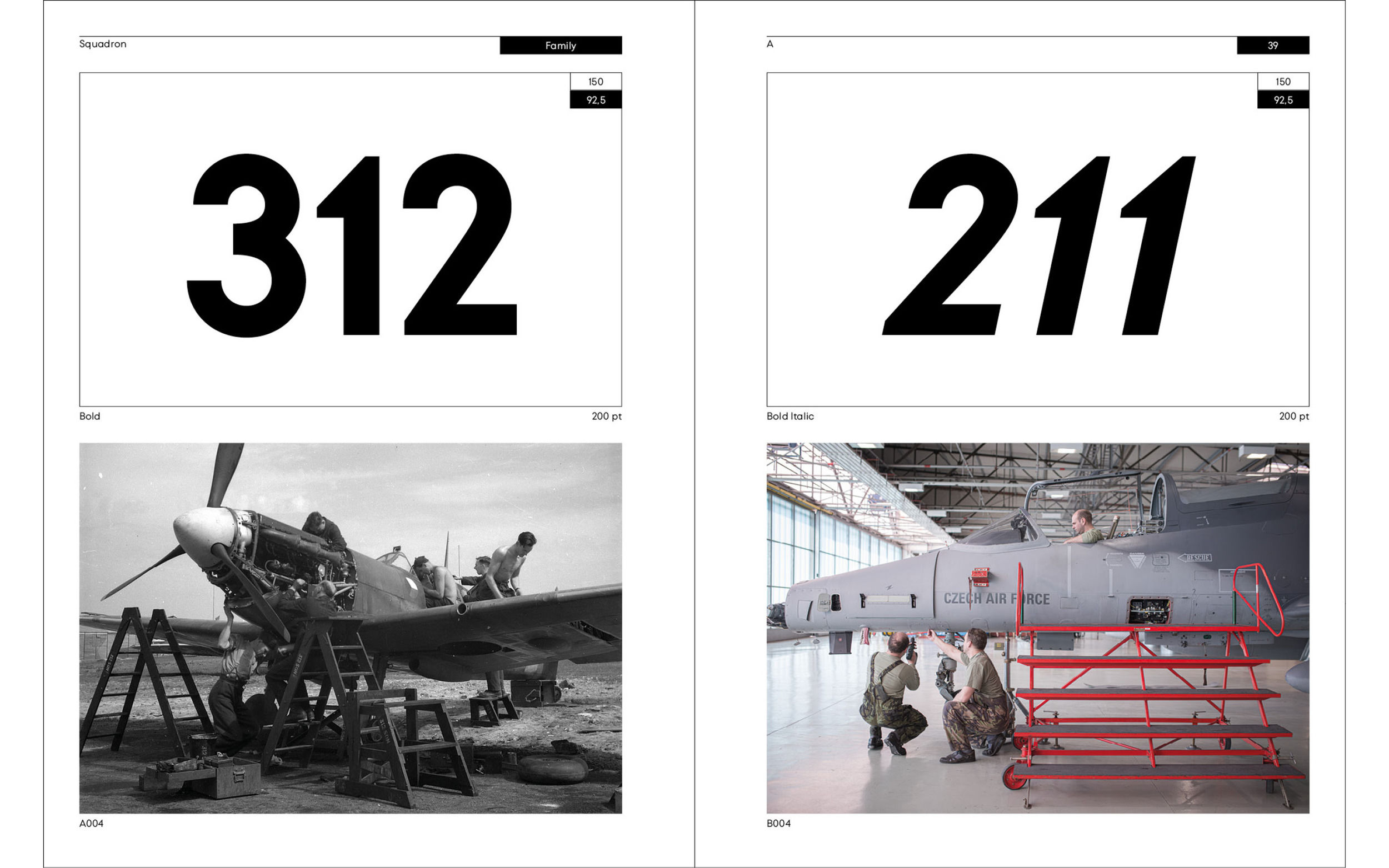
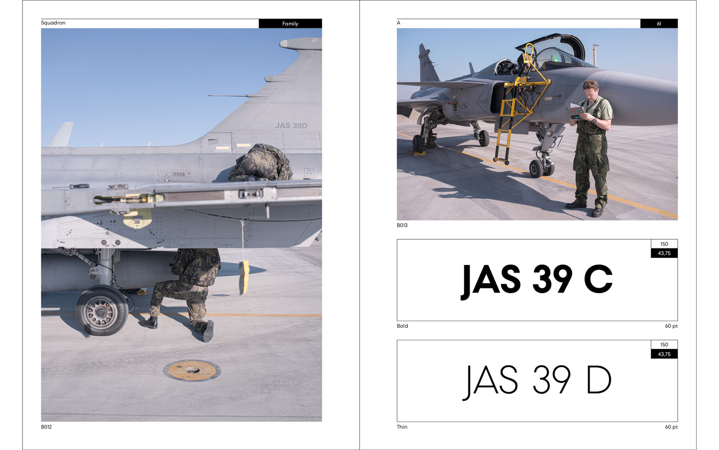
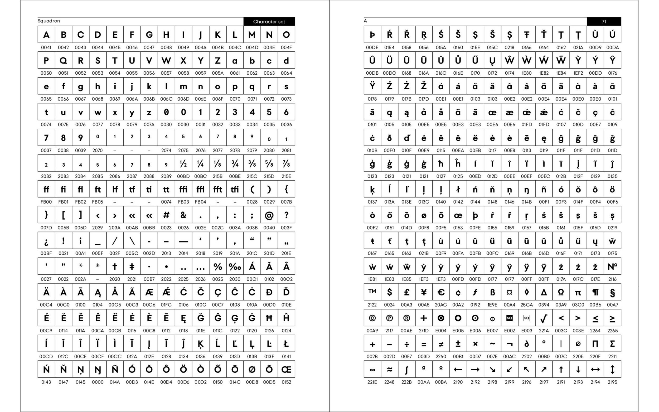
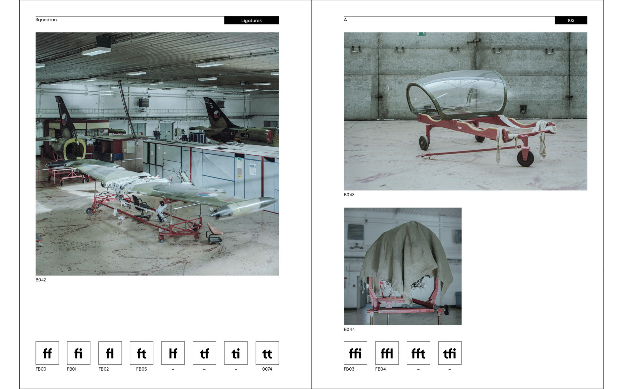
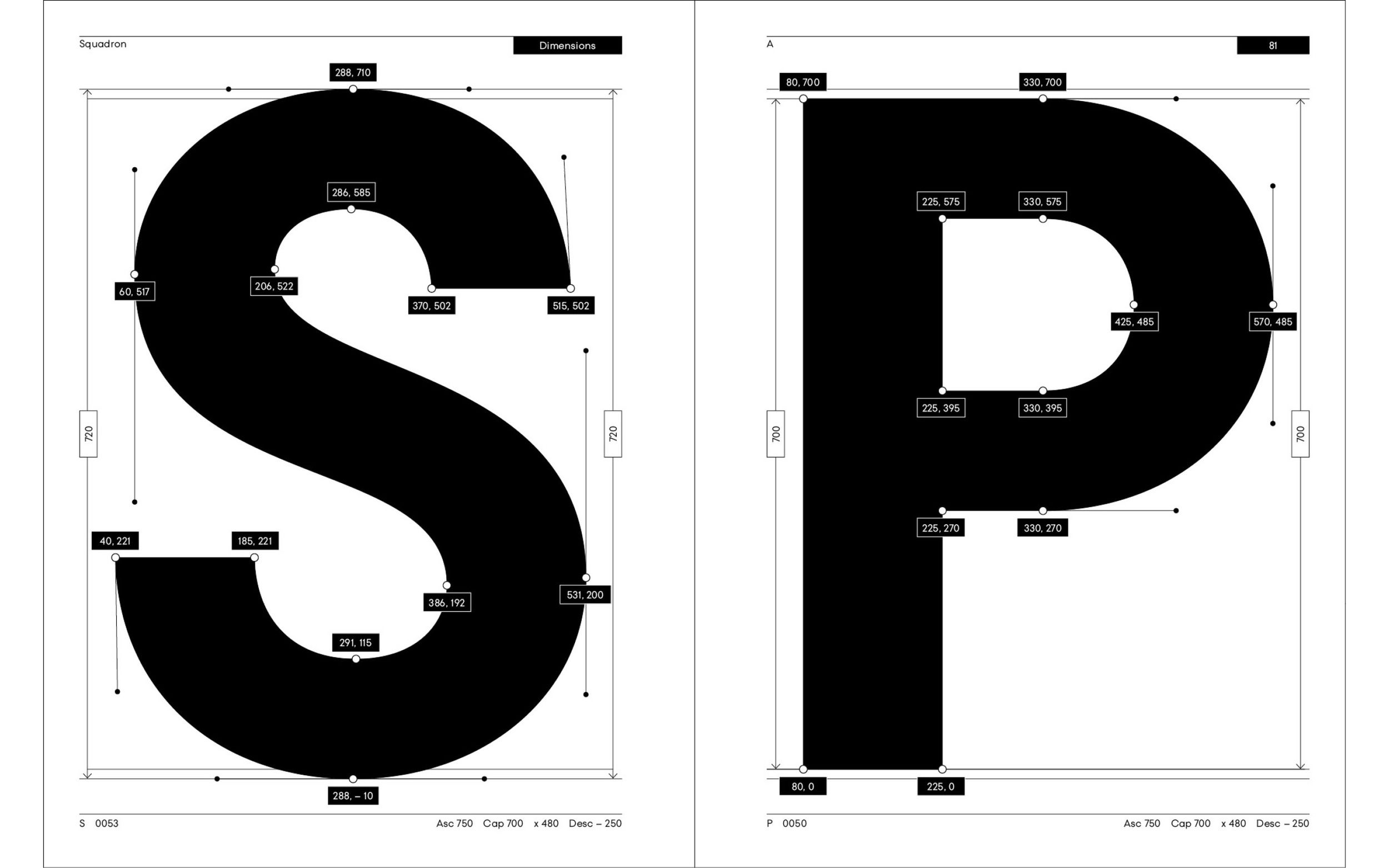
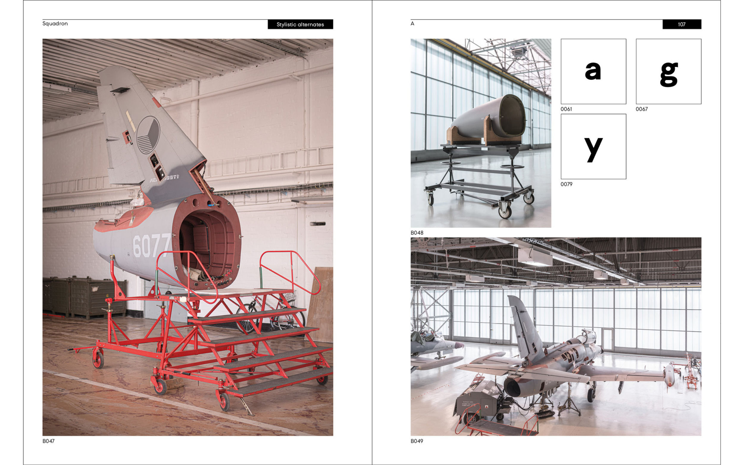
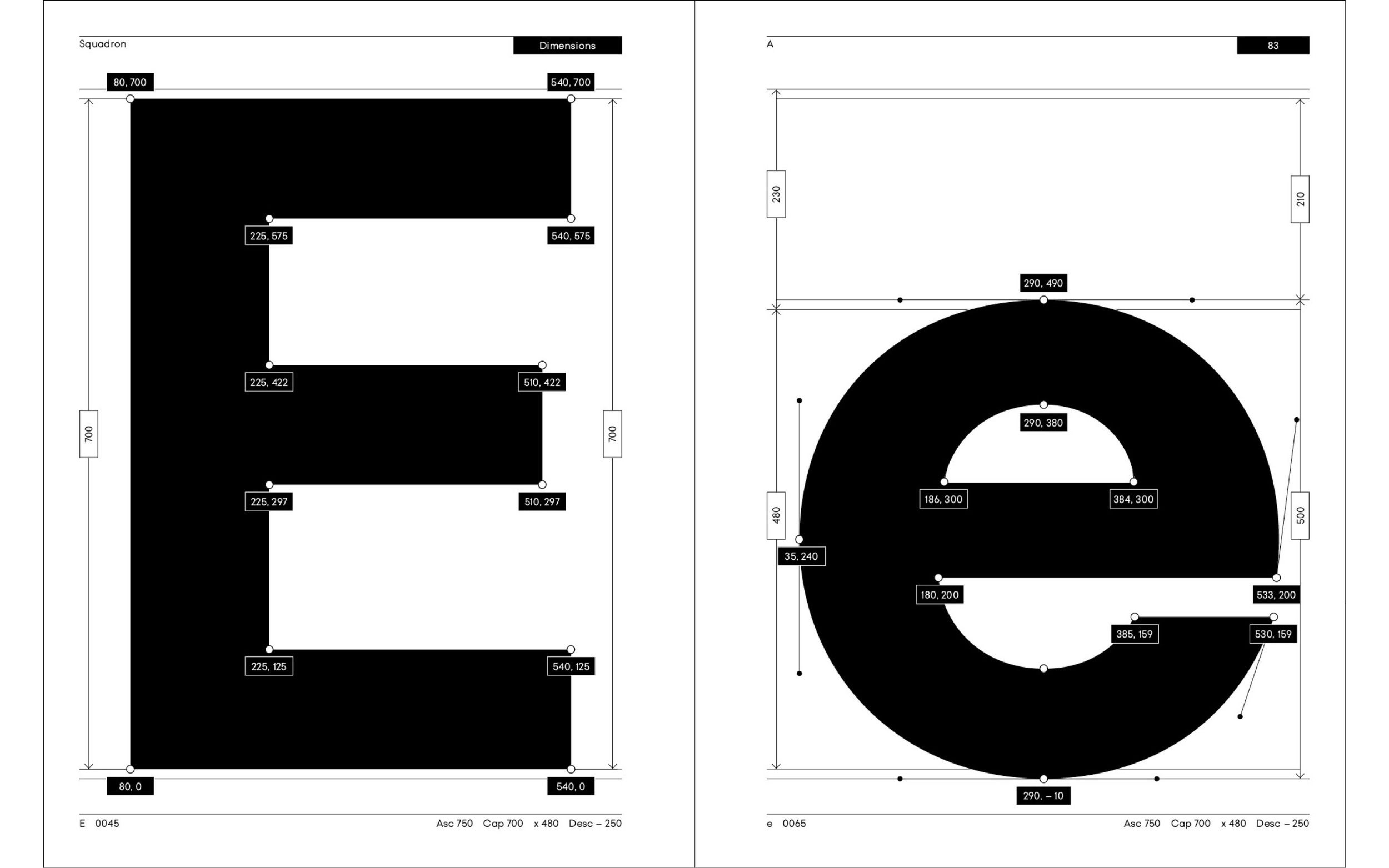
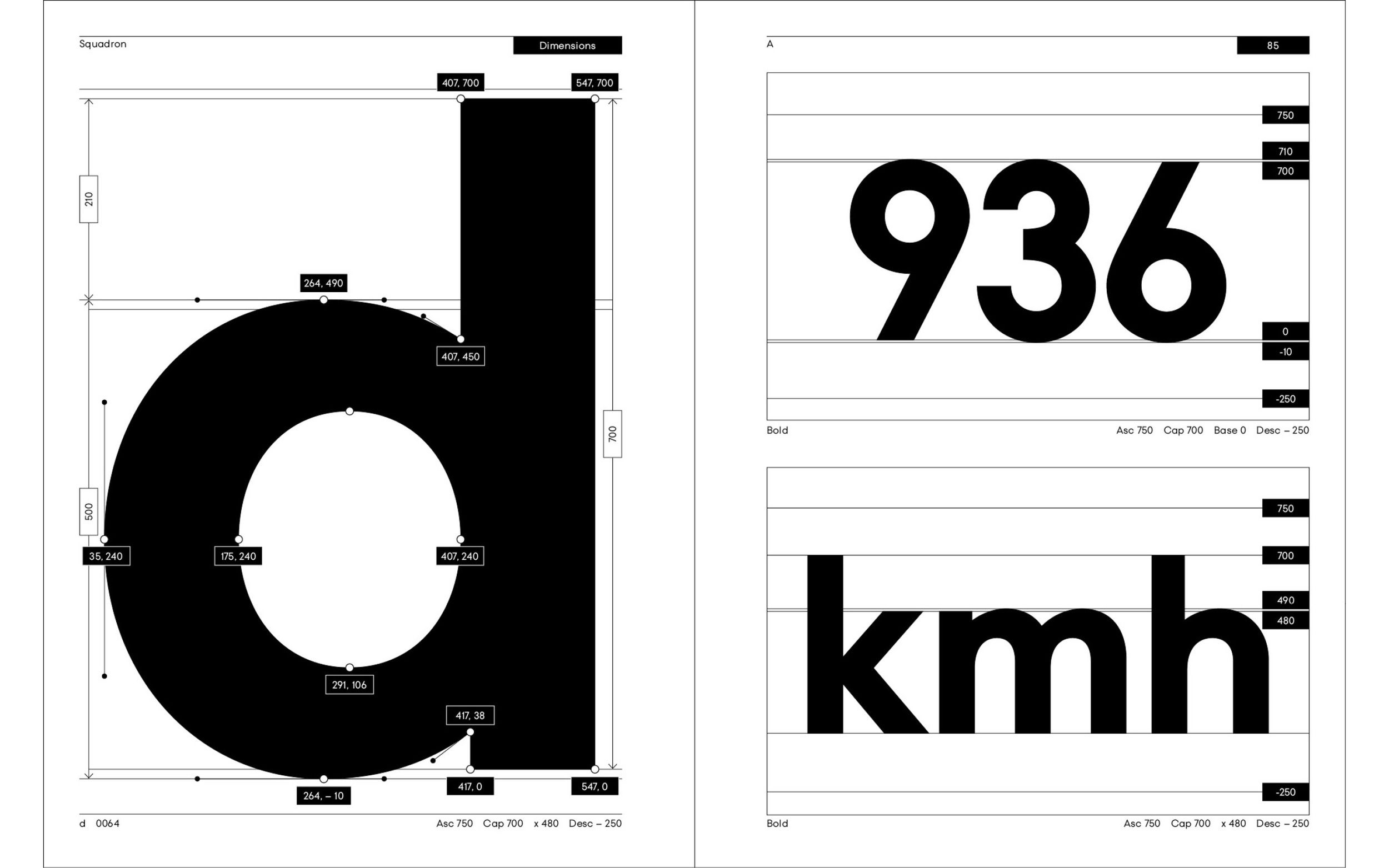
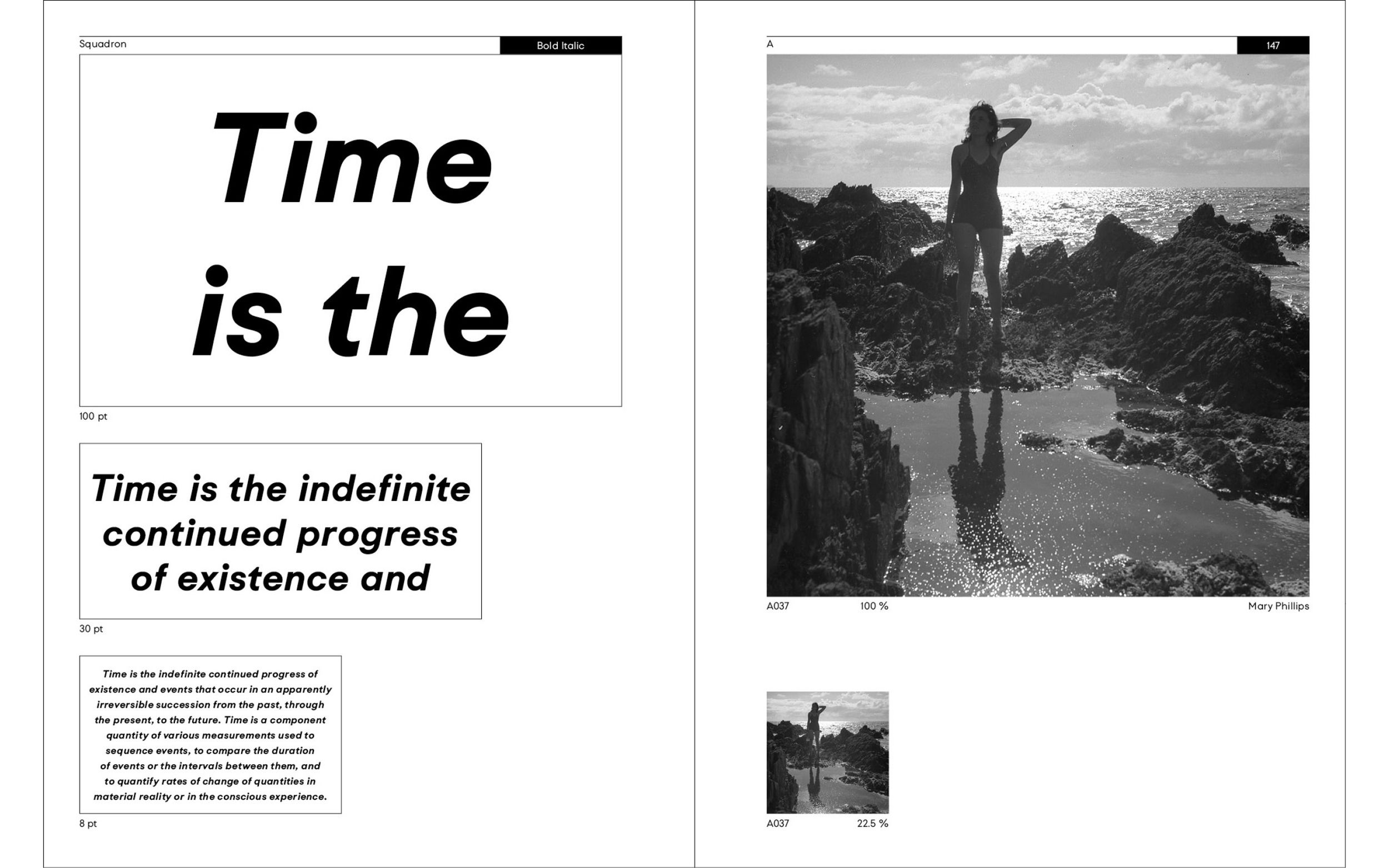
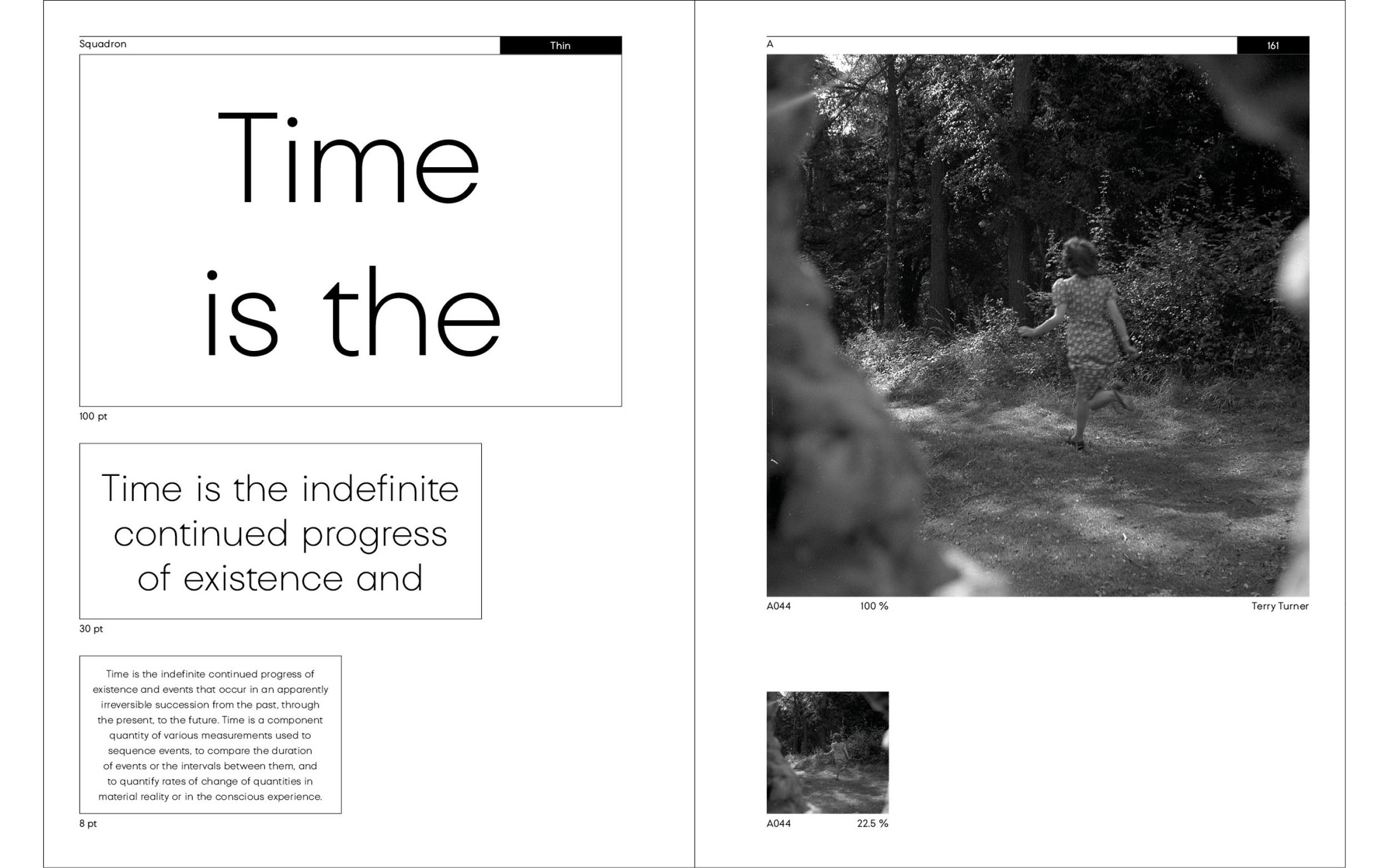
SQUADRON is rooted in the shape of the circle. Characters are shaped individually and infused with its own life. For example, the detail of the lowercase “t“ evokes the tail of a Spitfire. The final type family consists of three core weights (Thin, Regular and Bold), complemented by a cursive set (Light Italic, Regular Italic and Bold Italic).
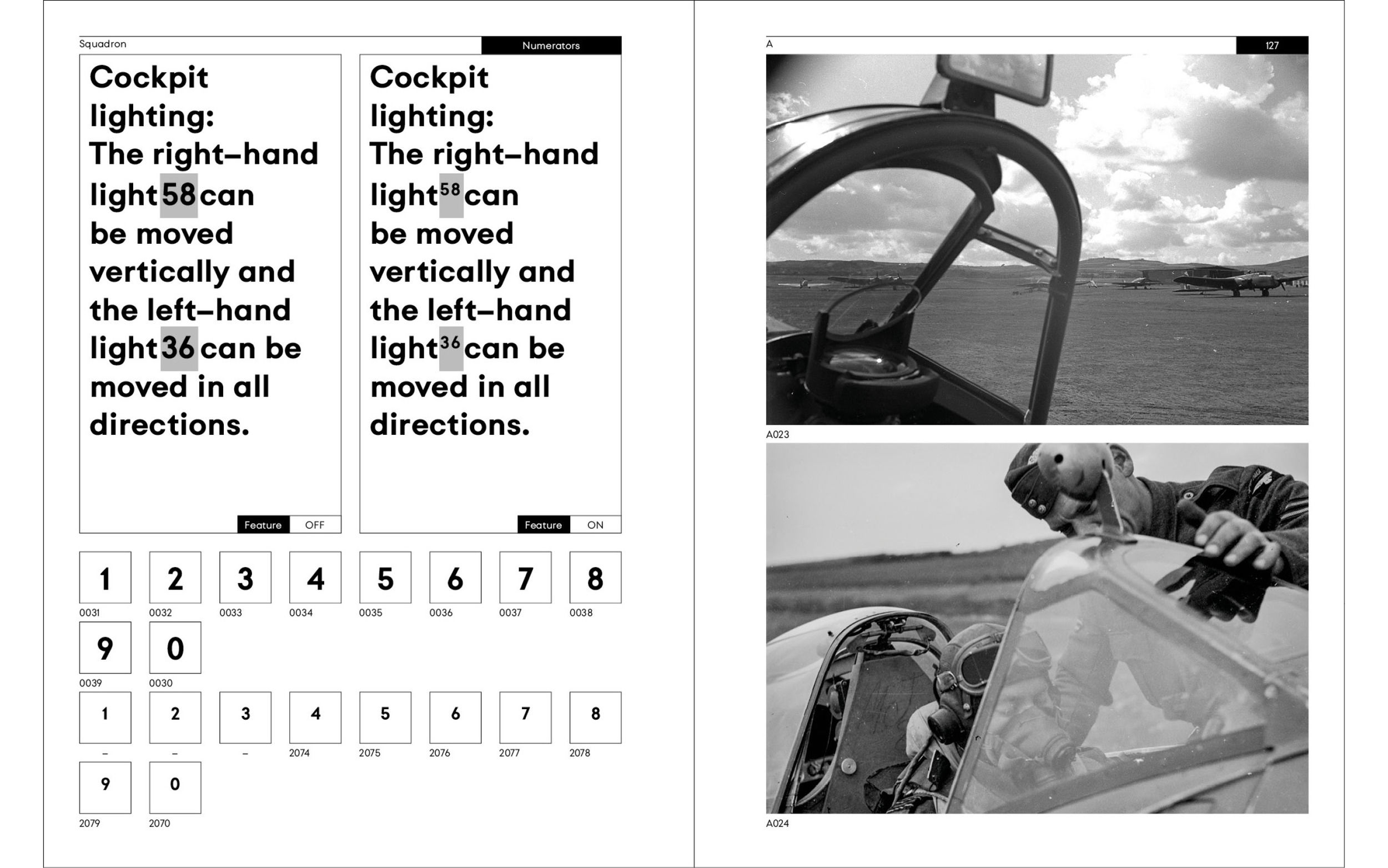
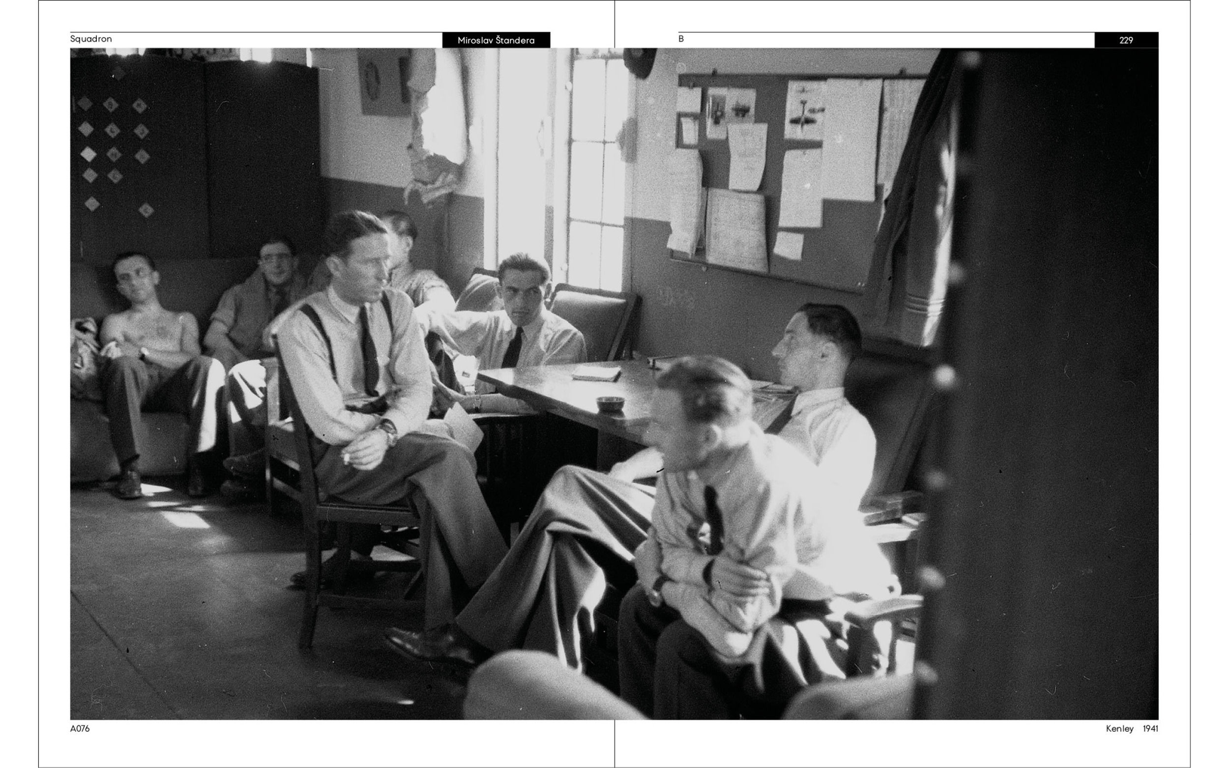
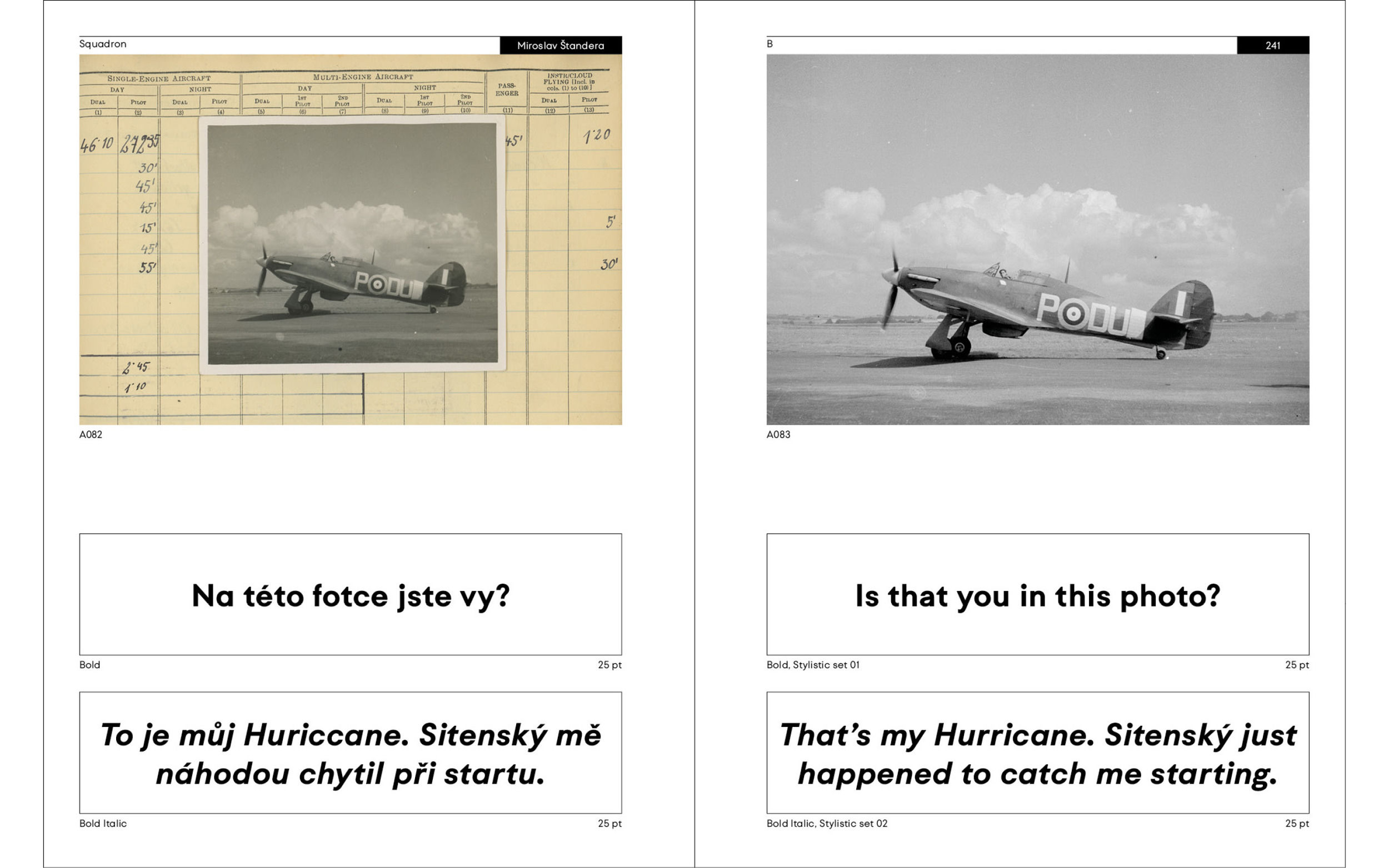
As the typeface took shape, we have been immersed in detailed research. In 2013, my colleague Vojtěch Veškrna photo-documented the life at the Čáslav air base. Just a few weeks later, while exploring the archives of famous Czech photographer Ladislav Sitenský we were struck by striking visual parallels between the airmen in World War II and those of today.
Flying Type Family
To push our research even further, we sought out someone who had experienced it all – general Miroslav Štandera (1918 — 2014), a WWI pilot who, coincidentally, was also trained as a typographer. Our rare conversation with this remarkable man gave us invaluable insight. Just a month after our meeting, Mr. Štandera passed away.
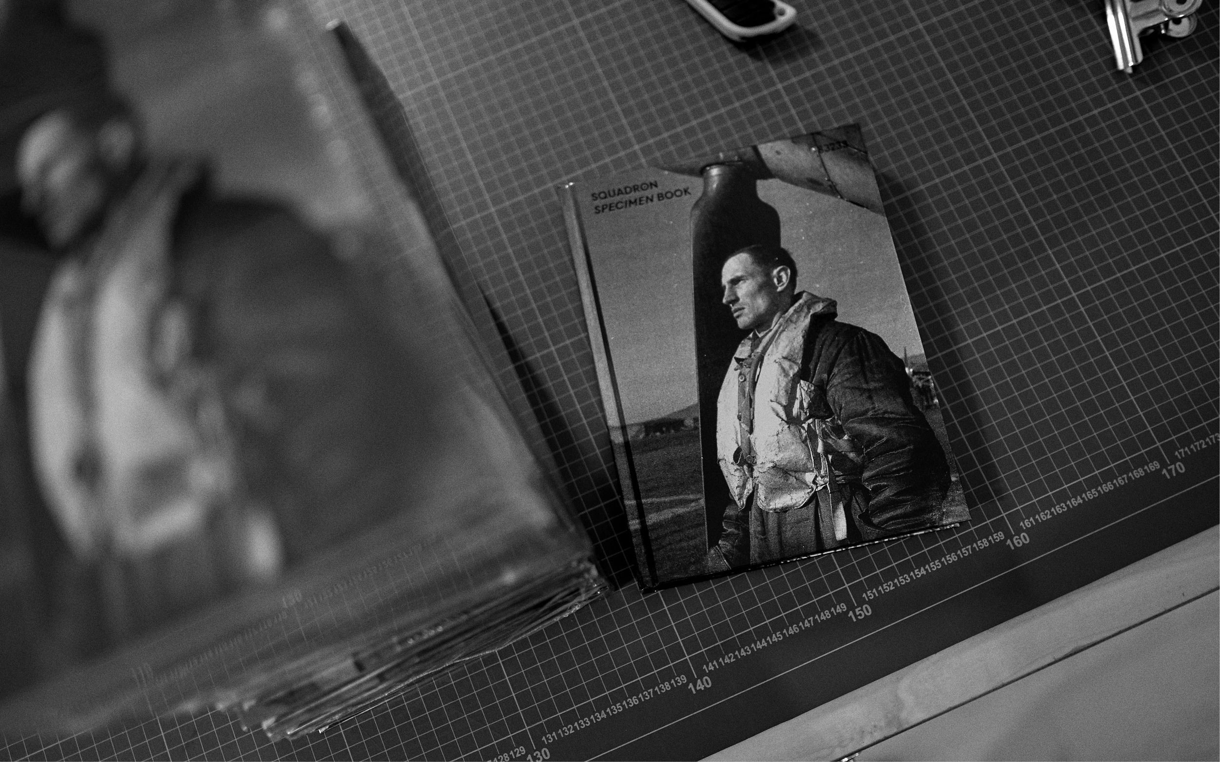
As the research continued, we began constructing the typeface in tandem with imagery, approaching it in a modular way just as an aircraft is built from individual components. We deconstructed text into sentences, words, and individual characters, creating a visual structure where text and image influenced one another in a dynamic interplay. The result of our efforts is a type family and a specimen book that, as a tangible object, captures a fleeting moment of history’s light.
Book from the clouds
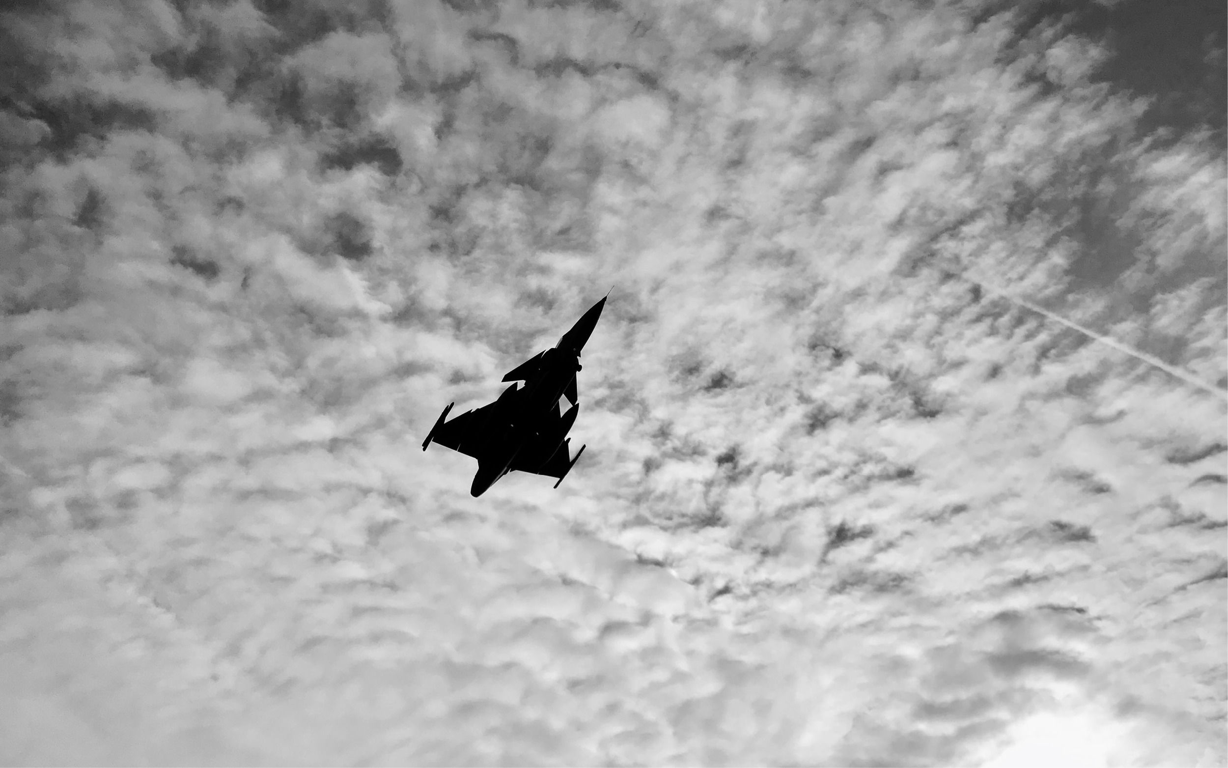
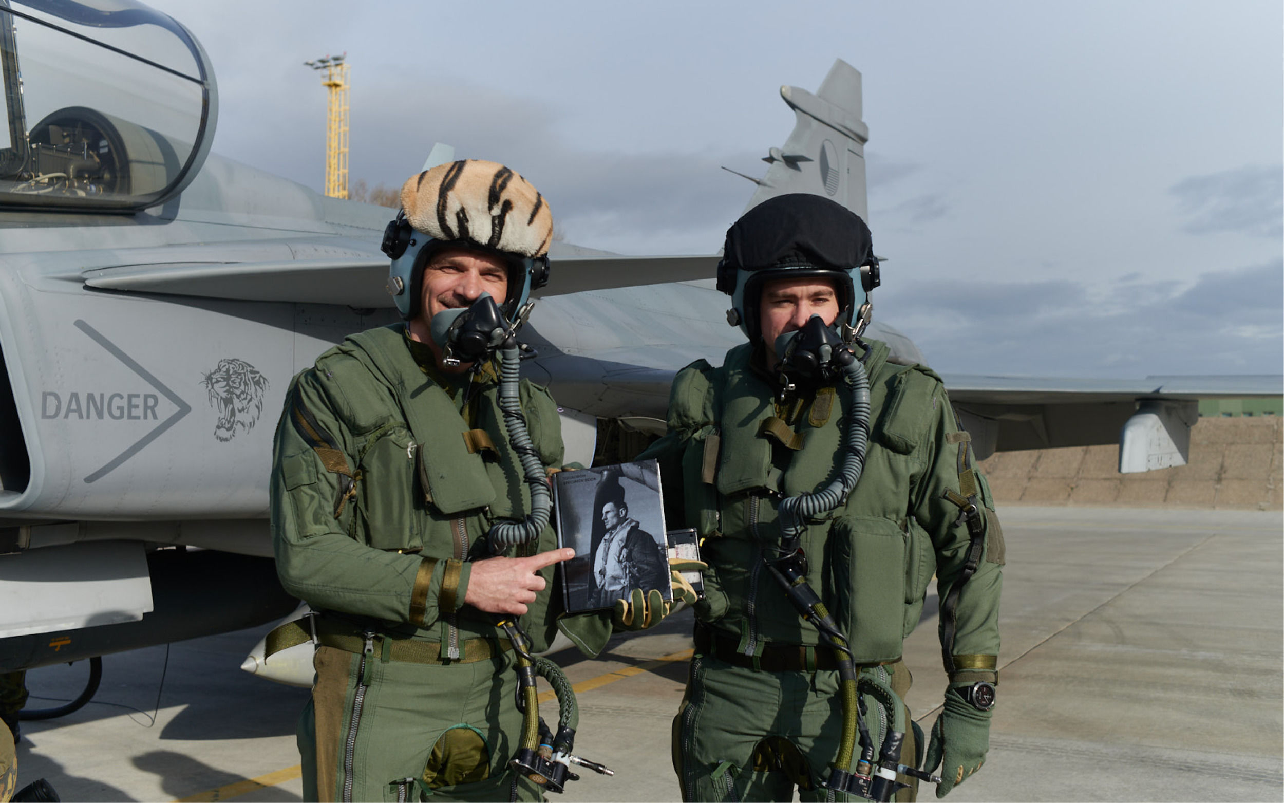
A final note: Books can be released in several ways with champagne or other liquids. I wanted something different. And so, thanks to the generosity of the pilots at the Čáslav base, SQUADRON was released into the world by flying in a supersonic aircraft.
Category
Type design
Book design
Research
Conception, Graphic and Type design
Jan Matoušek
Photography
Ladislav Sitenský, Vojtěch Veškrna
Typeface cooperation
Jan Horčík
Publisher
Biggboss
Award
Most beautiful Czech book (Nominee)
Year
2019