Famufest
(2008)
While still a student at UMPRUM in Prague, I was invited by FAMU students to create the visual identity for FAMUFEST, a multi-genre film festival. As one of my first client works I approached it with sparkling enthusiasm.
At that time, FAMU had a progressive logotype designed by Petr Babák – a flexible stripe that could be stretched to any width. I think its full potential was never realized. But at the time, I was tempted to reach that “endless” potential.
Color Strikes
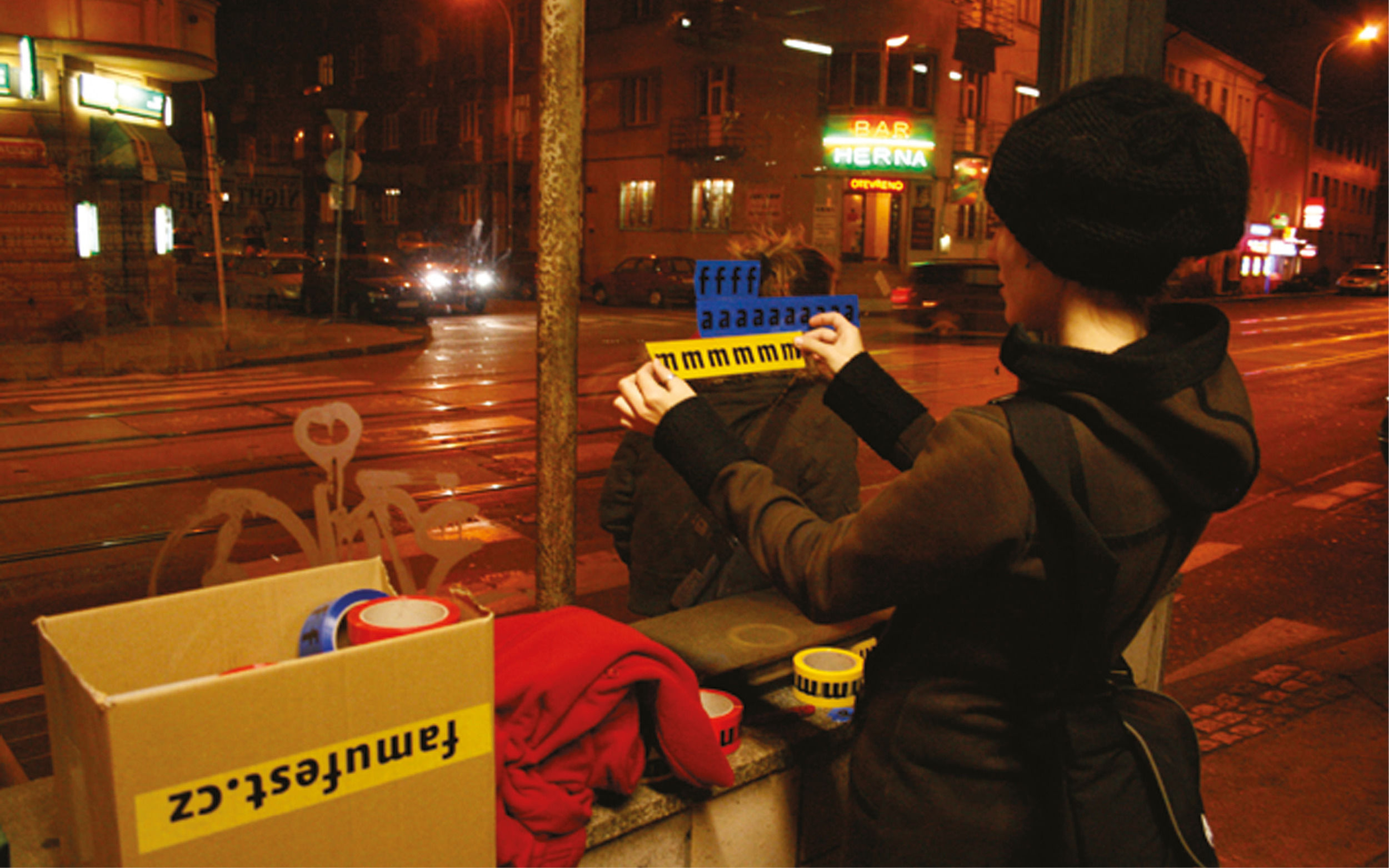
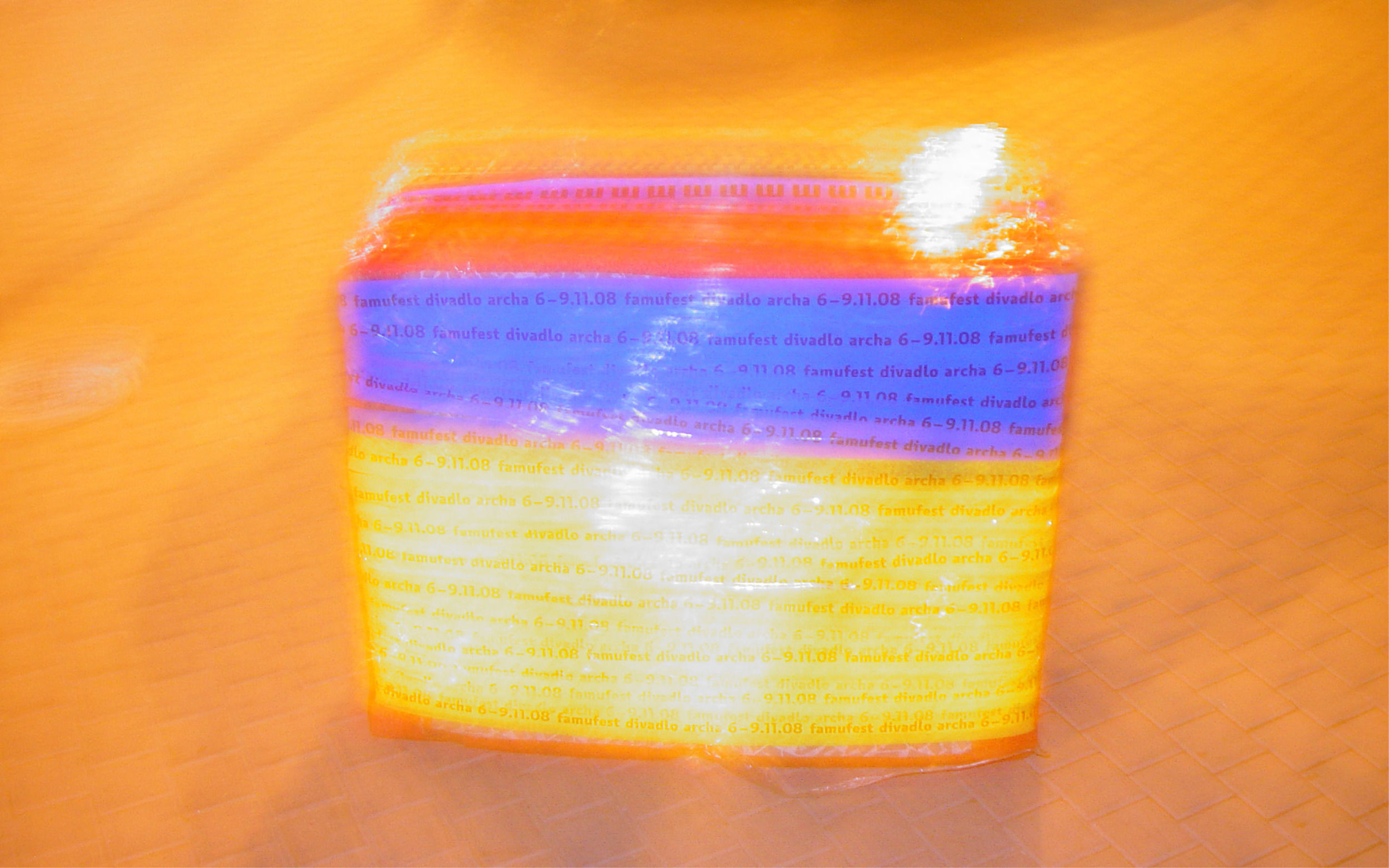
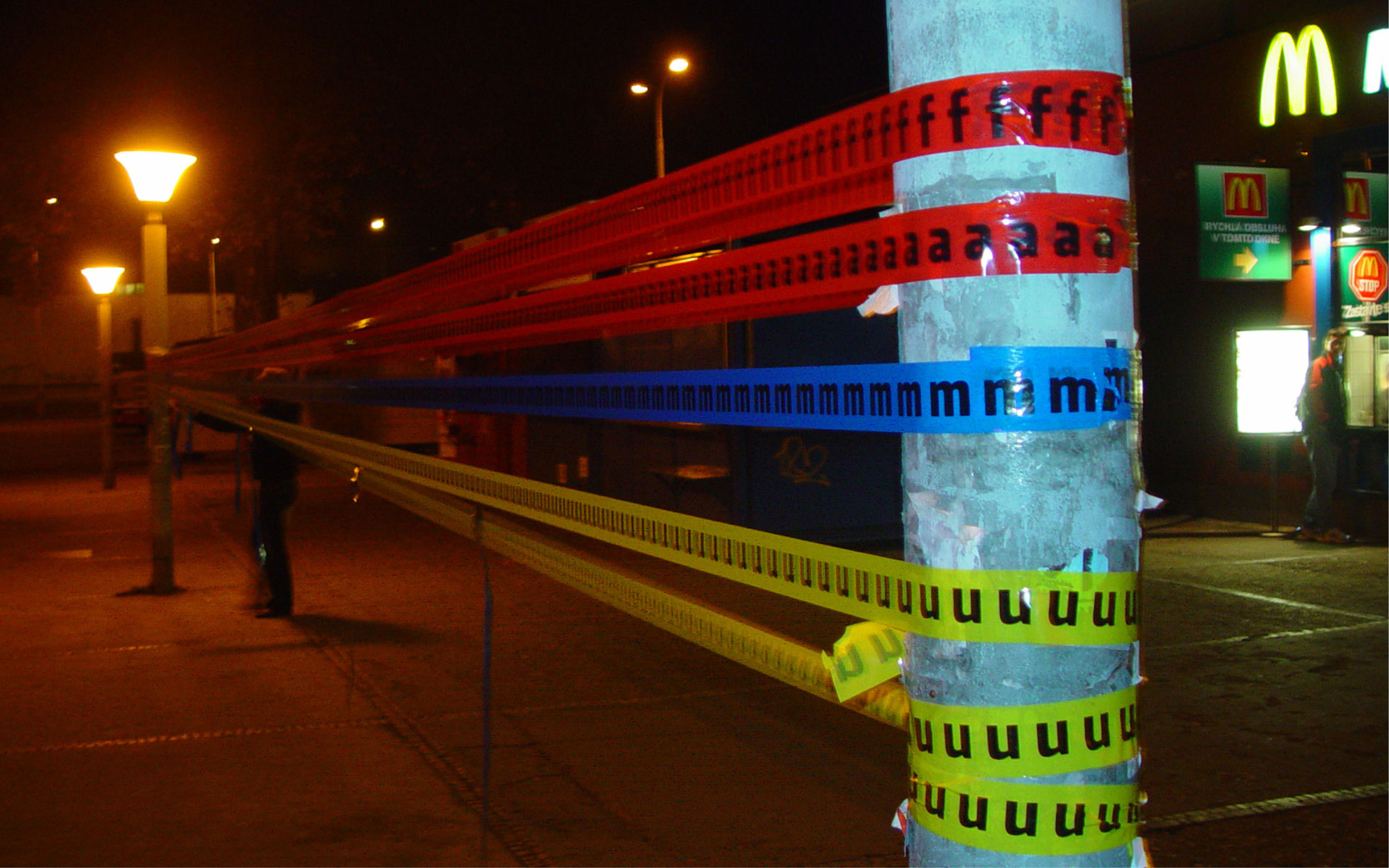
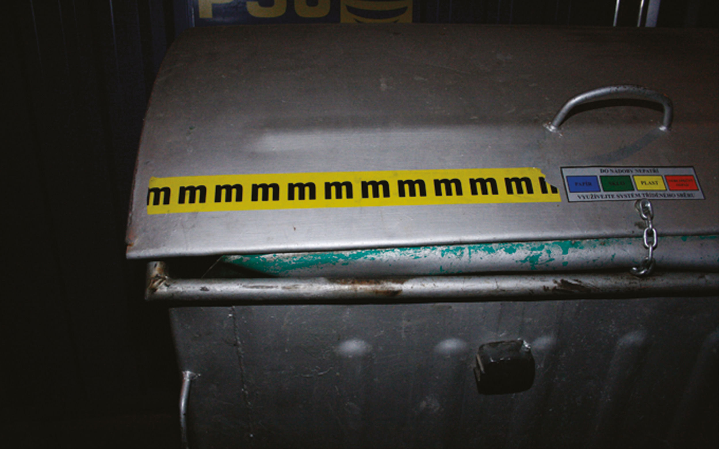
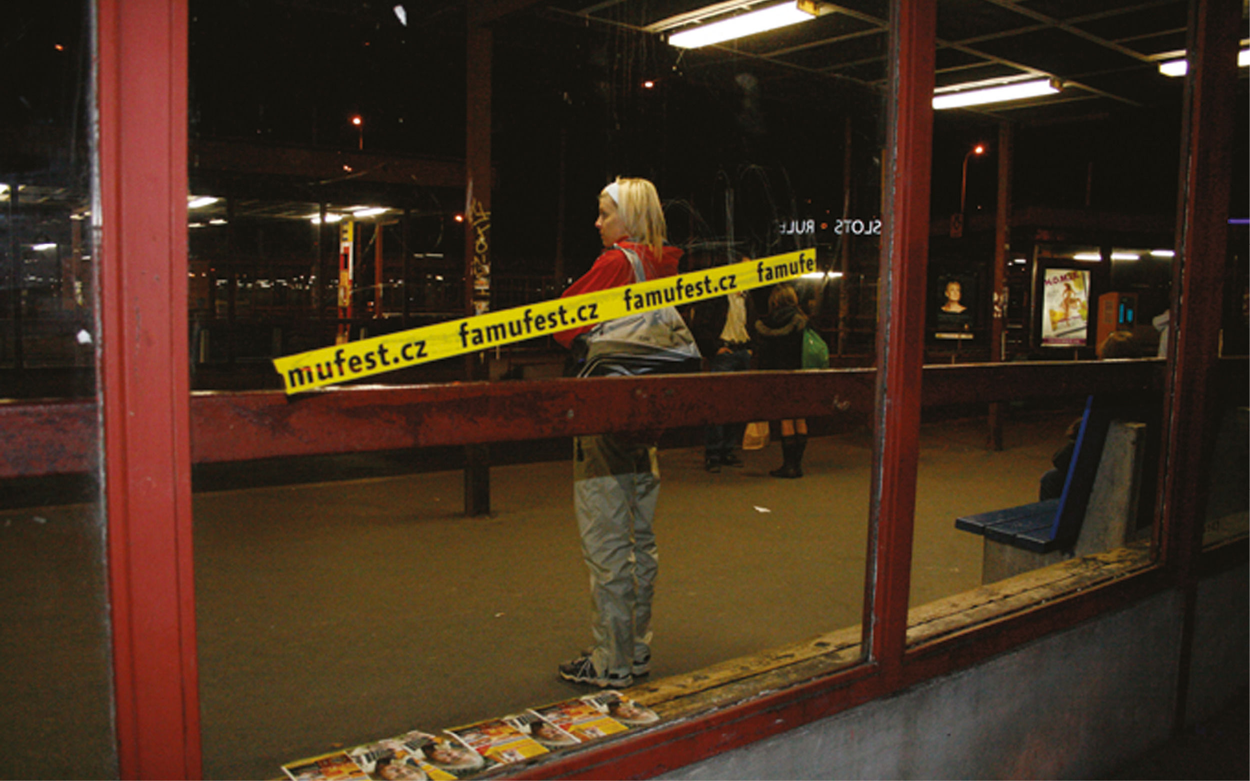
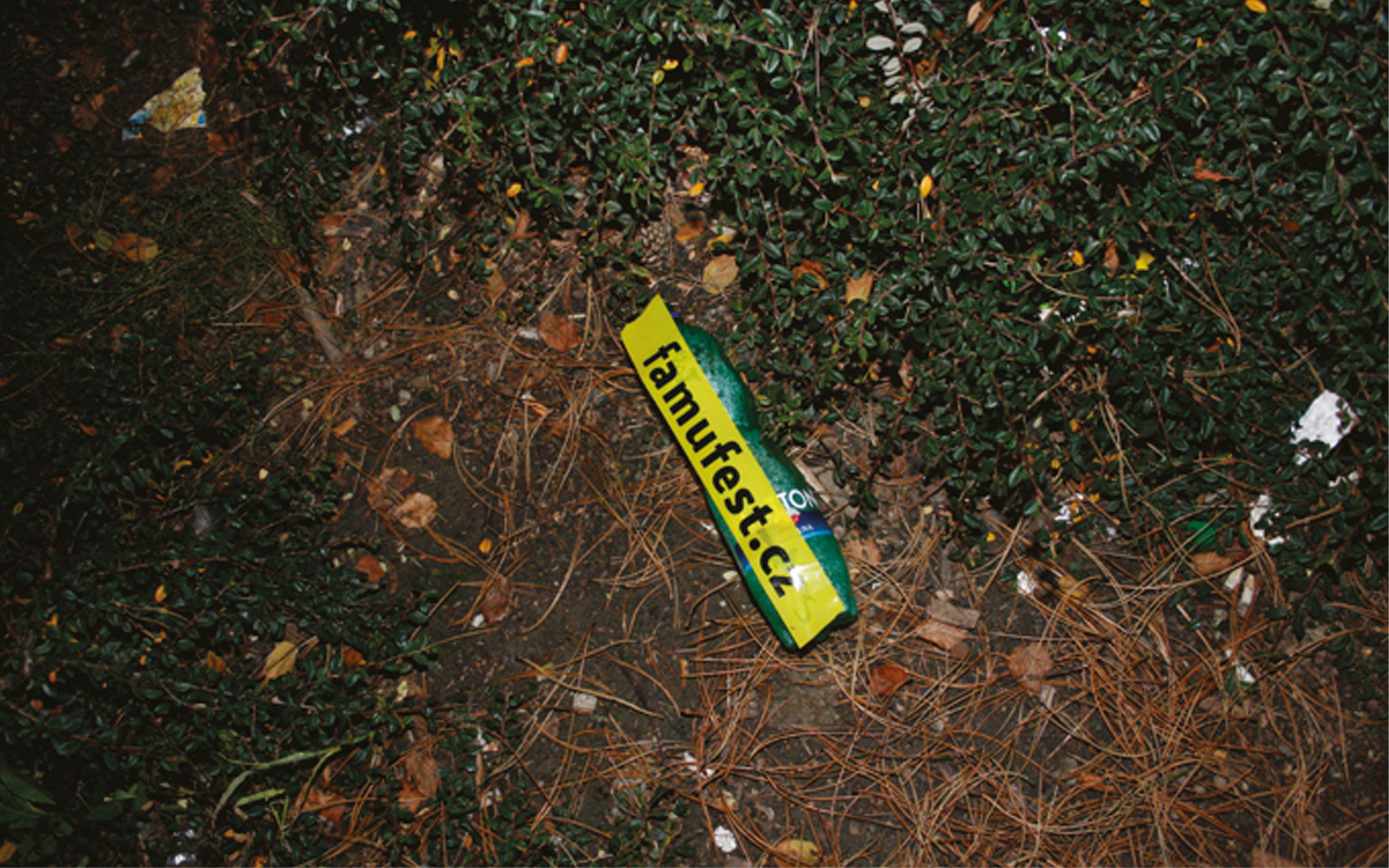
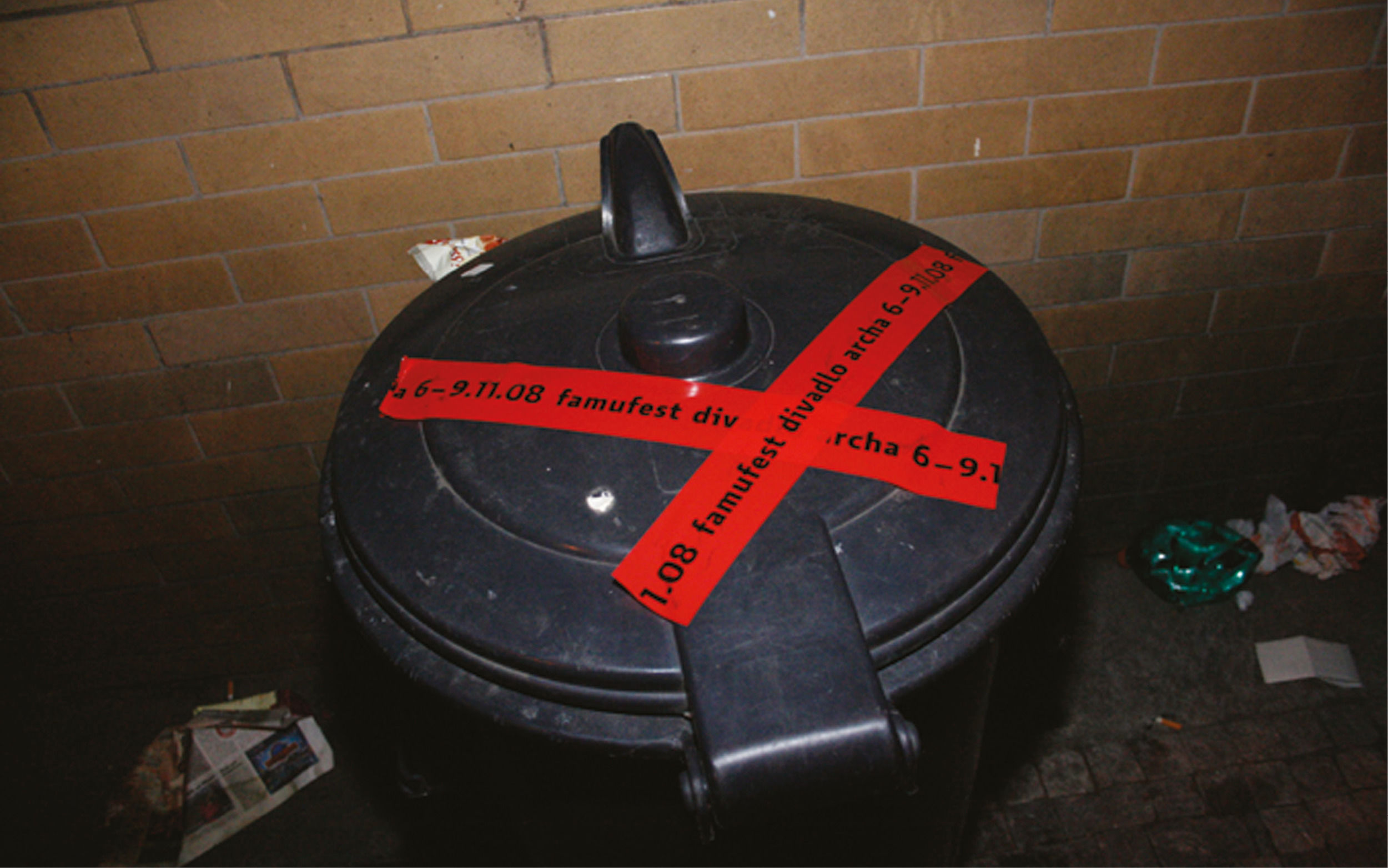
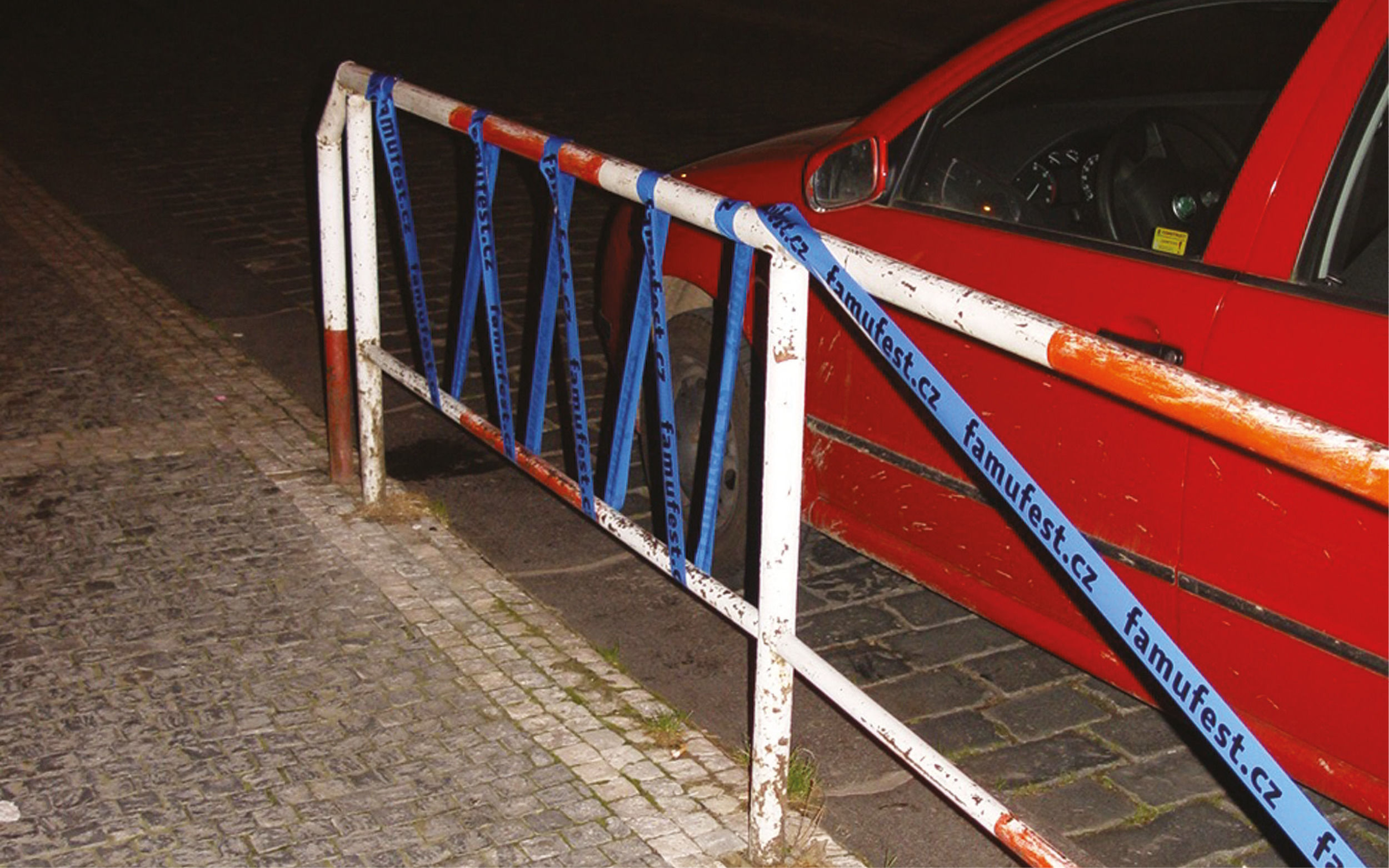
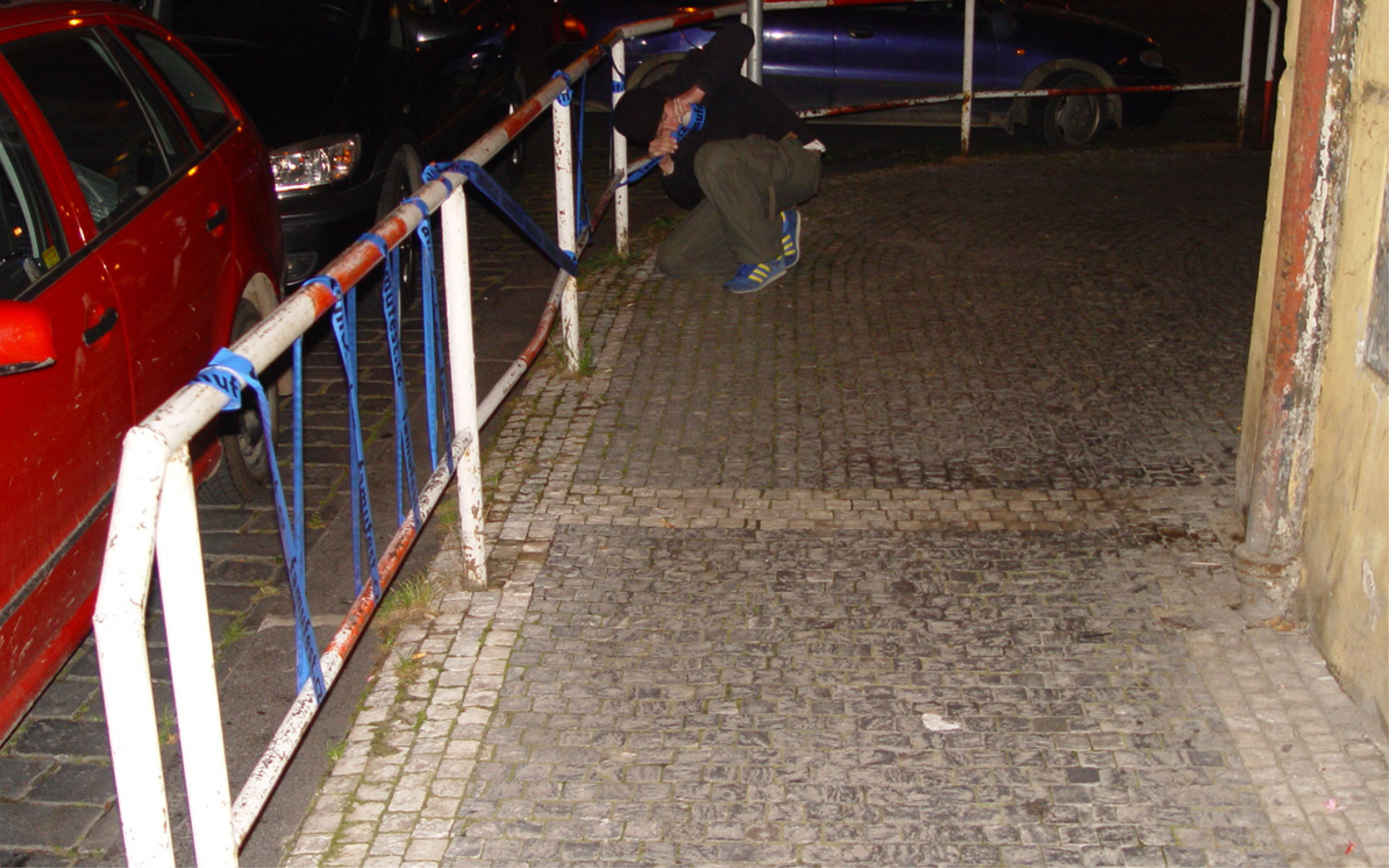
This desire led to a rather simple idea: instead of static posters, we would print the festival’s key information—dates, times, and locations—on colorful adhesive tapes and distribute them freely among students. The color bombing was ready to be launched. Within a few days, numerous compositions made of printed tapes, in various ranges of widths and colors, began appearing across the streets of Prague.
This guerilla-style approach perfectly captured the playful and spunky nature of the student festival. Even today, fragments of those colorful stickers can still be seen on the streets.
Category
Visual identity
Creative direction and graphic design
Jan Matoušek, Tereza Hejmová
Client
Academy of Performing Arts in Prague (FAMU)
Photography
FAMU students, JM archive
Year
2008